Monday, 19 April 2010

Bodyshop

I have been working on a brief for the Bodyshop. The brief is to reinstate the Bodyshop's position as the original pioneer of ethical beauty. I decided this was a chance to do a brief completely by hand. I miss being off screen and being able to draw something start to finish. Anyway here are a few of the drawings I have completed so far. Each poster reflects a value. I felt using mainly typography was the best approach for this. I have not yet decided on a colour scheme. That is what I will be spending time on tonight. 


Exhibition Poster

This brief is a poster which I created for the Faculty of Arts Exhibition 2010. It's not the best thing iv'e done but bearing in mind I done it in like an hour. Hopefully ill get time to go back to it at the end and spend alot more time with it.

Newton Rigg

This is an identity I created for a new trademark  under the Newton Rigg Enterprise. The circular mark represents renewable energy. The mark has also been created to reflect the company's main aim which is to promote a sustainable future for our environment. 


Below are the guidelines for the Bioenergy identity.


H G Wells

I am currently working on my final major projects. The first project I completed was a series bookcovers for one of the 20th Century's acclaimed authers, H G Wells. My concept reflected each character in the stories, who had lost their place in society, their identities. The images have been created to put across this idea. 


Rubix Channel

For this brief I was asked to create an identity for an international television brand. Their personality was to be bold and reflect their love for drama, reality Tv, films, soaps and niche programmes. I decided to create one main company and several channels which branched from this company, each of which building up the personality of Rubix Productions. I decided to use bold colours throughout to create a bold, distinctive identity, each colour in the square represents a channel part of Rubix Productions.

I created a set of business cards for each channel and stationery for rubix productions as a whole. I also created a set of guidelines for the identity.




Thursday, 10 December 2009

This was an identity I created for a company called Zest, which consists of a restaurant and harbour side Cafe/bar. We were asked to create an identity that could be applied to both so I had to create a logo which could be versatile.
I have applied both logos to a set of business cards, letterheads and compliments slips. I also created a menu for Zest restaurant and mailers which included recipes from both.

These are my final designs for Zest restaurant and Harbourside


Sunday, 11 October 2009

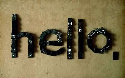
Well thats me back at university for the final year! scary! Thought I would have a quick update to where I am at the moment. First brief  has just finished, well kind of! final hand in isn't until November. We basically had to create our own typeface. This involved a lot of experimenting with lots n lots of materials, we were only allowed to use white which got a bit boring! think I must of bought half of the material shop! but anyway here are some of my experiments.


This was the front of my mailer which I am changing to a poster :)